大屏开发技术总结
一、引入echarts实现大屏图表
使用教程
1、安装
npm install echarts --save2、配置
import * as echarts from 'echarts';3、使用 根据自己需要的echat进行选择(例子)
<!-- 设备运行情况图表 -->
<template>
  <a-row :gutter="16">
    <a-col class="gutter-row" :span="12">
      <div class="gutter-box" >
        <h3 style="color: white;">CNC运行情况占比:</h3>
        <div class="chart-container" ref="CNC_chartContainer" style="margin-top: 16px"></div>
      </div>
    </a-col>

</template>

<script>
  import * as echarts from 'echarts';

  export default {
    name: 'DeviceStatusChart',
// TODO: 这里需要修改成从后端获取数据
    data() {
      return {
        //CNC数据
        CNC_rawData: [
          [320, 132, 101, 134],
          [220, 182, 191, 234],
          [150, 212, 201, 154],
          [820, 832, 901, 934],
        ],
        CNC_totalData: [],
        CNC_chartInstance: null,
        CNC_option: null,
      };
    },

    // TODO:这里方法或许可以复用
    mounted() {
      this.$nextTick(() => {
        this.CNCinitChart();
      });
    },
    methods: {
      // 初始化图表
      CNCinitChart() {
        const chartDom = this.$refs.CNC_chartContainer;
        this.CNC_chartInstance = echarts.init(chartDom);
        this.CNCcalculateTotalData();
        this.CNCgenerateSeriesData();
        this.CNC_chartInstance.setOption(this.CNC_option);
      },
      // 计算总数据
      CNCcalculateTotalData() {
        for (let i = 0; i < this.CNC_rawData[0].length; ++i) {
          let sum = 0;
          for (let j = 0; j < this.CNC_rawData.length; ++j) {
            sum += this.CNC_rawData[j][i];
          }
          this.CNC_totalData.push(sum);
        }
      },
      // 生成系列数据
      CNCgenerateSeriesData() {
        const series = ['加工时间(分钟)', '待机时间(分钟)', '无灯时间[换料/就绪](分钟)', '报错时间(分钟)'].map((name, sid) => {
          return {
            name,
            type: 'bar',
            stack: 'total',
            barWidth: '60%',
            label: {
              show: true,
              formatter: (params) => Math.round(params.value * 10000) / 100 + '%', // 修改此处,使用toFixed可以更简洁
            },
            itemStyle: {
              // 添加这一行来设置颜色
              color: ['#91CC75', '#ede211', '#73C0DE', '#cc060d'][sid], // 根据sid选择颜色
            },
            data: this.CNC_rawData[sid].map((d, did) => (this.CNC_totalData[did] <= 0 ? 0 : d / this.CNC_totalData[did])),
          };
        });
        this.CNC_option = {
          legend: {
            selectedMode: false,
            // 为所有图例设置默认的文字颜色
            textStyle: {
              color: '#ffff', // 黑色,可以自定义颜色
            },
          },
          grid: {
            left: 100,
            right: 100,
            top: 50,
            bottom: 50,
          },
          yAxis: {
            type: 'value',
          },
          xAxis: {
            type: 'category',
            data: ['机台1', '机台2', '机台3', '机台4'],
          },
          series,
        };
      },
</script>

<style scoped>
  .gutter-box {
    margin-top: 24px;
    background: linear-gradient(to right, rgba(4, 4, 107, 0.5), rgba(69, 62, 162, 0.5));
    padding: 8px 0;
    height: 350px;
  }
  .chart-container{
    width: 95%;
    height: 90%;
  }
</style>
二、使用 Ant Design Vue 的栅格进行布局
Ant Design Vue 提供了一个强大的栅格系统,用于创建灵活和响应式的布局。这个栅格系统基于24列,可以轻松地适应不同的屏幕尺寸,并且支持Flex布局特性,使得布局更加灵活。
下面是如何使用 Ant Design Vue 的栅格进行布局的一些步骤和示例:
1. 引入栅格组件
首先需要确保已经安装了 Ant Design Vue,并在你的项目中正确引入了栅格组件。
javascript深色版本
1import { Row, Col } from 'ant-design-vue';
2Vue.use(Row);
3Vue.use(Col);
2. 使用栅格组件
栅格组件由 Row 和 Col 构成。Row 代表一行,Col 代表一列。
基本用法
深色版本
1<template>
2  <a-row>
3    <a-col :span="8">col-8</a-col>
4    <a-col :span="8">col-8</a-col>
5    <a-col :span="8">col-8</a-col>
6  </a-row>
7</template>
响应式布局
你可以通过 xs, sm, md, lg, xl 这些属性来设置不同屏幕尺寸下的列宽。
html深色版本
1<template>
2  <a-row>
3    <a-col :xs="24" :sm="12" :md="8" :lg="6" :xl="4">col</a-col>
4    <a-col :xs="24" :sm="12" :md="8" :lg="6" :xl="4">col</a-col>
5    <a-col :xs="24" :sm="12" :md="8" :lg="6" :xl="4">col</a-col>
6    <a-col :xs="24" :sm="12" :md="8" :lg="6" :xl="4">col</a-col>
7  </a-row>
8</template>
列间距
使用 gutter 属性来定义列之间的间距。
深色版本
1<template>
2  <a-row :gutter="16">
3    <a-col :span="6">col-6</a-col>
4    <a-col :span="6">col-6</a-col>
5    <a-col :span="6">col-6</a-col>
6    <a-col :span="6">col-6</a-col>
7  </a-row>
8</template>
对齐方式
justify 和 align 属性可以用来调整列的水平和垂直对齐方式。
深色版本
1<template>
2  <a-row :gutter="16" justify="center" align="middle">
3    <a-col :span="6">col-6</a-col>
4    <a-col :span="6">col-6</a-col>
5  </a-row>
6</template>
三、uniapp里用了ucharts的图表,跑h5项目图表一直处于加载中
如下图所示
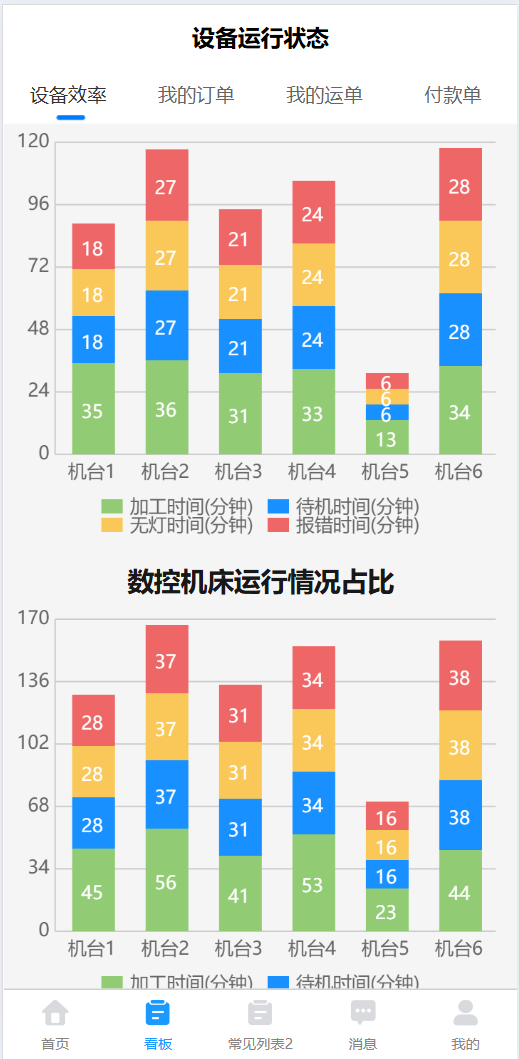
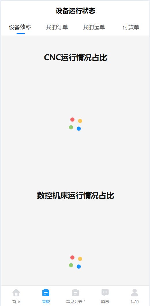 解决方法:将默认的onReady写成created或者mounted即可
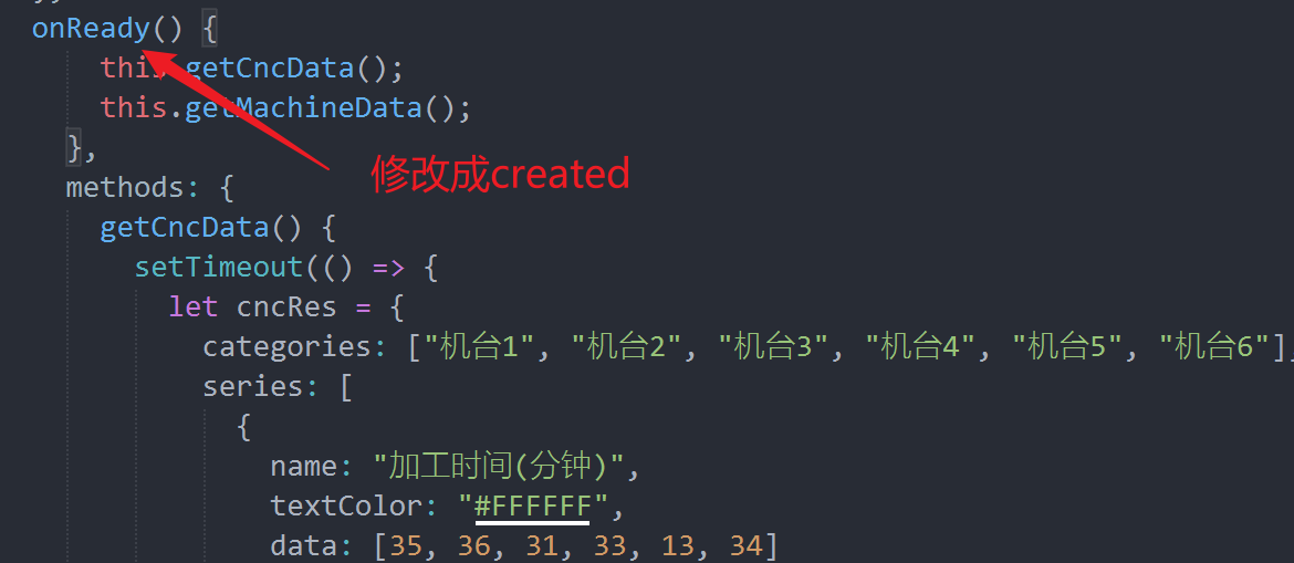
大屏开发技术总结
http://localhost:8090//archives/uniappzhong-shi-yong-uchartsyi-zhi-zai-zhuan-quan-xian-shi-zai-jia-zai